|
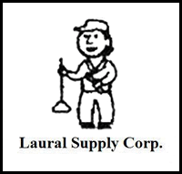 |  | 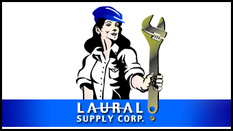 |
Laural Supply: Branding a Woman-owned business
The previous gender-neutral cartoon character was eliminated in favor of a strong, confident woman. Easy-to-read wordmark combined with new character. Wrench (as exclamation mark!) replaced plunger to further promote strength. Blue and gold color palette added to black for impact, and extension to web and collateral graphics.
|
|
 | | 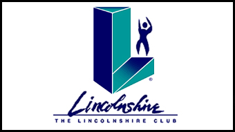 |
The Lincolnshire Club: Revitalized tennis courts, workout facilities... and logo
I created an upscale image for a growing, multi-faceted athletic club. The monumental "L" acts as a workout treadmill as well as a victory platform. Hand-lettered "Lincolnshire" connotes exclusivity as a personalized "autograph". Human form is both male and female: gender is in the eye of the beholder.
|
|
 | |  |
The Kalva Corporation: I scream, you scream, we all scream for ice cream!
Because this ice cream coatings company logo had equity in the marketplace since its inception in 1935, I retained the essential logo elements while condensing them into a more unified unit By eliminating the superfluous white space around the letterforms, the new wordmark can now appear larger in smaller applications (business cards and packaging)!
|
|
 | |  |
AquaHealth: Healthy is now sustainable
Aquahealth realized that their product line was perfectly suited for the growing green marketplace and sought to invest its identity with a tagline that is Earth friendly. Letterforms are strengthened with a dropshadow, and set against a patterned background.
|
|
 | |  |
Northwestern University: Masters of their own identity
Intertwined stylized DNA strand and wordmark to announce the university's new masters program. Color palette adheres toNorthwestern University's strict design rules.
|
|
 | |  |
Care in the Home: Health Services with a Heart
Several equity elements were combined into a cohesive single unit that is easily placed on business cards, collaterals, signage and vehicles. The important word, "care", was enlarged for emphasis "in the home" phrase was placed on a single line and logically brought within the outlined home shape "Health Services" now shares the same typeface as other words.
|
|
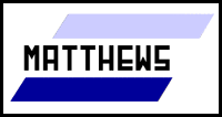 | |  |
Matthews Employment: This North Shore company has provided a bridge between employers and job-seekers since 1969. With an evolving workplace, their old-fashioned logo began to feel outdated. Because the logo had recognition in the marketplace, I adjusted the letterforms by adding some curves to soften and humanize the company. I raised the crossbars on the "A", "E" and "S" to prevent them from filling in when printed in small applications. I also added a metallic shading to the horizontal bars, plus a light dropshadow to give life - to help it pop off the page (and screen).
|
|
 | |  |
Shaars International: The client purchased a very attractive logo from one of those impersonal online Web sites. Once I was hired to design the Web site, I commented that, while we could use the logo, it would make more sense to showcase a cargo ship. The president of the company, also a Naval Captain, agreed, and we created a colorful logo that shows exactly what the company does: import and export large cargoes.
|
|
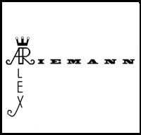 | | 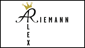 |
Alex Reimann: This Social Media expert wanted to develop his own brand for personal use. While he had access to computer tools, he asked for assistance to refine his basic concept, including a more elegant ligature of his initials, and a complimentary typeface.
|


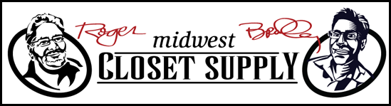
Midwest Closet Supply: This company, run by two brothers lacked an online personality. I crafted a couple of good ol' fashioned caricatures, and combined them with matching signatures to brand their business with the personal touch.
|