|

Midwest Closet Supply
Selling products in a market whose competitors are Home Depot and Lowe's required the presentation of a personality: the "Little guys" versus the Big Box stores. The cool colors were overhauled in favor of warm oranges, reds and browns to reflect the hardwood closets. Caricatures were drawn to present "two brothers on one mission" to provide personalized service for selecting everything from individual components to full closet systems.
|  |  |
|
|

MinXray
This highly successful manufacturer needed to focus site visitors on their four distinct product lines. I took advantage of wider screen formats and made large headings to route customers to DIGITAL, MEDICAL, VETERINARY and MILITARY equipment. Where possible, I included photos in natural (vs. sterile) settings with people and animals enjoying the benefits of MinXray's portable devices.
| |  |
|
|

Samson Roll Form
I first updated the letterforms of the logo to match the "Superman S" symbol; and increased the font size: "Roll Formed Products Company"; then included a large AudoCad file folder at the base of the navigation bar. Next, I branded their Samson Shape Book, making it as exciting as a Harry Potter magic tome. The reason? Their hundreds of pre-tooled shapes save customers a lot of money by avoiding creation of unique dies. Next, I included an over-the-shoulder photo of an engineer to humanize the site. I feature a regular announcement in the bottom right, to keep customers apprised of company news. Finally, an American flag and red-white-blue theme remind visitors to "Buy American".
| |  |
|
|
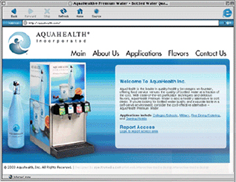
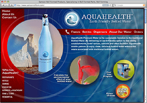
Aquahealth
As the company evolved its product line to combat plastic bottles filling landfills, a new branding strategy was required. I wrote the tagline: "Earth-friendly bottled water" and incorporated it into the logotype. Next, I featured their refillable bottle among Nature's glaciers and pristine water, added colors and imagery from nature and a watery background design that ripples through the whole Web site. As part of the programming, we inserted an environmental cost calculator to help people gauge their own impact on our shared environment.
| |  |
|
|

Pizzeria Aroma
This popular neighborhood restaurant serves more than just pizza. I brightened the colors of their Web site, and inserted a slideshow of color photos of salads, ribs, pastas, and of course pizza too! I placed a TEXT signup in the header of every page, and links to Facebook and Twitter too, to encourage customer interaction. Specials are offered every day via TEXT, facebook and twitter.
| |  |
|
|

Minnihan Painting
Establishing a look-and-feel for an artist and muralist was a fascinating challenge. I worked collaboratively with the client on everything from color palette to proportions, fonts and photo selection. The result: An impeccable balance of color, shape and line - just like Paul's work for his clients!
| |  |
|
|
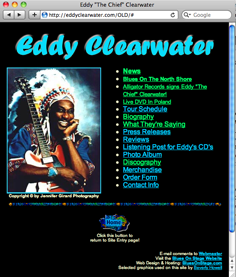
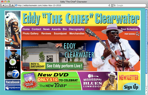
Eddy Clearwater
This Chicago Bluesman is known for his colorful outfits and exciting showmanship. I designed his Web site to reflect his personality. I also incorporated audio and video into the site.
| |  |
|
|
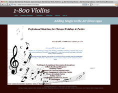
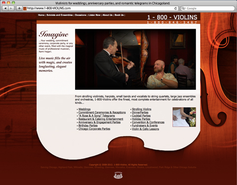
1-800-VIOLINS
Rami Hagari, a long-time Chicago Violinist needed to personalize his site. I warmed it up with oranges and browns; and added photos of him playing solo works, and with fellow musicians.
| |  |
|